Feature #701
improve legibility of search results
100%
Description
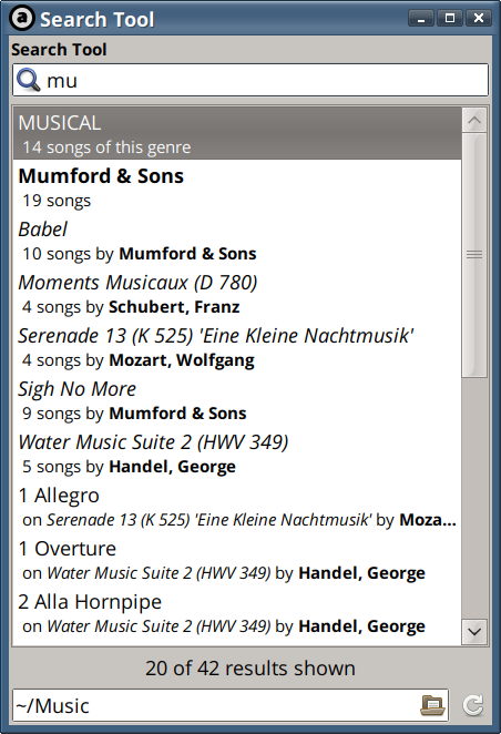
I find the results in the Search Tool very hard to read (see screenshot).
Perhaps this could be improved by some appropriate formatting, say bold for album names. Or maybe even a different color, suitably chosen. Alternatively you could include a small icon indicating album right next to an album, and another indicating artist next to artist, etc.
Bottom line is that I like Audacious but have a hard time with the Search Tool which I use extensively.
History
#1
 Updated by John Lindgren about 9 years ago
- Tracker changed from Bug to Feature
#2
 Updated by John Lindgren about 9 years ago
Yes, this is something I hope to improve in the Qt UI eventually.
#3
 Updated by John Lindgren about 9 years ago
- File search-tool.png search-tool.png added
Actually this was easier than I thought. Screenshot:

#4
 Updated by John Lindgren about 9 years ago
- Category set to plugins/search tool
- Status changed from New to Closed
- Target version set to 3.9
- % Done changed from 0 to 100
#5
 Updated by Liviu Andronic about 9 years ago
Looks great, thanks!
Do you think it would be difficult to add horizontal separators (i.e. lines) between "categories". For instance, a horizontal line after 'MUSICAL', another after 'Mumford & Sons', another after '5 songs by Handel, George'. In short, some sort of logical separation between the categories...
#6
 Updated by John Lindgren about 9 years ago
Separators would also be nice, but a little harder to implement.
#7
 Updated by Liviu Andronic about 9 years ago
Should I open a new report for this?
#8
 Updated by John Lindgren about 9 years ago
If you like, but I don't think it will get implemented any time soon.
