Feature #705
re-arrange playback controls
100%
Description
A couple more minor UI requests... I have always been a fan of Sonata for minimalistic and elegant interface. (Unfortunately though they use MPD, and I keep getting bogged down with its configs.)
I would like to make some very minor suggestions that would, I believe, make sense for Audacious.

Sonata's buttons arrangement is the only one in my experience that does not make me think twice how the playback buttons should be arranged, generally. They're positioned very intuitively:
 and <next> are at the extremes (left and right), in the middle comes the play/pause combo followed by the stop button. This is an arrangement that makes sense, to me at least.

So if look at the current layout in Audacious,

!Screenshot_2017-02-20_09-10-07.png!

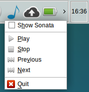
this request would boil down to moving the <next> button to the right of <stop>. Incidentally, this would make the toolbar layout consistent with the systray icon c-menu:

!Screenshot_2017-02-26_23-31-01.png!
History
#1
 Updated by Liviu Andronic about 9 years ago
Clearly the wiki formatting doesn't like me, so I'll try again:
[...]
They're positioned very intuitively: Prev and Next are at the extremes (left and right), in the middle comes the Play/Pause combo followed by the Stop button. This is an arrangement that makes sense, to me at least.
So if you look at the current layout in Audacious,

this request would boil down to moving the Next button to the right of Stop. Incidentally, this would make the toolbar layout consistent with the systray icon c-menu:

#2
 Updated by John Lindgren about 9 years ago
- Category set to plugins/gtkui
- Assignee set to John Lindgren
I can see some sense to either arrangement, but I tend to agree with you if only for consistency. The Winamp interface has always had Prev-Play-[Pause]-Stop-Next, and it matches the ZXCVB key shortcuts.
Incidentally, the Qt UI has Play-[Pause]-Stop-Prev-Next, so we currently have three different layouts. Ugh.
#3
 Updated by Liviu Andronic about 9 years ago
- File Screenshot_2017-03-23_16-34-41.png Screenshot_2017-03-23_16-34-41.png added
- File Screenshot_2017-03-23_16-36-51.png Screenshot_2017-03-23_16-36-51.png added
I can see some sense to either arrangement
I would actually agree with you on this: I too see value in both arrangements, though in different contexts.
For the toolbar, I would favor exclusively the Prev-Play-[Pause]-Stop-Next layout. As mentioned earlier, this seems to be the most natural way of ordering the controls.
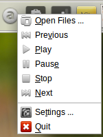
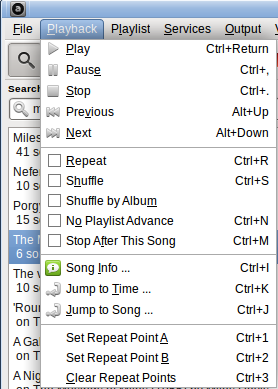
For menus, however, I see sense in having the Play button first in the list, like this: Play-[Pause]-Stop-Prev-Next. This is how things are currently in the Playback menu (which seems to be the same layout as in the Qt UI): 
Incidentally, this is the arrangement used in Sonata for the systray c-menu: 
So while having two different arrangements for the layout and for the menus (main or systray) would break consistency, I see value in having the Play/Pause button as the first one in the menus. In my opinion the single most useful item in the systray c-menu is the Play/Pause button, which is what one would use most often and would expect "immediate" access to it. This is why making it easily accessible on top of all other controls would make sense to me...
I hope all this blather makes at least some sense!
#4
 Updated by John Lindgren about 9 years ago
- Status changed from New to Closed
- Target version set to 3.9
- % Done changed from 0 to 100
Liviu Andronic wrote:
... I see value in having the Play/Pause button as the first one in the menus. In my opinion the single most useful item in the systray c-menu is the Play/Pause button, which is what one would use most often and would expect "immediate" access to it. This is why making it easily accessible on top of all other controls would make sense to me...
Well, that only works if the system tray is at the top of the screen. :)
I've updated the toolbars; I think I'll leave the system tray as-is for the time being.
#5
 Updated by Liviu Andronic about 9 years ago
Well, that only works if the system tray is at the top of the screen. :)
True! Good point -- haven't thought of that. Though I would still argue that in the systray having Play on top makes sense as much as having Quit on the bottom, whether or not the systray is located top or bottom.
Anyways, thanks for looking into this!
