Feature #47

Audacious icon redesign/update
0%
Description
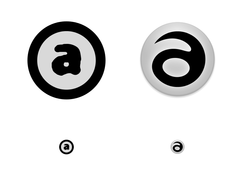
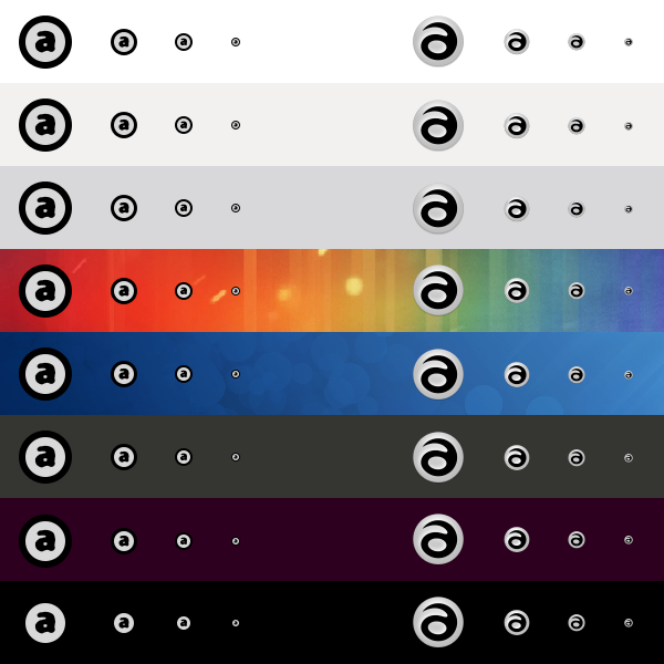
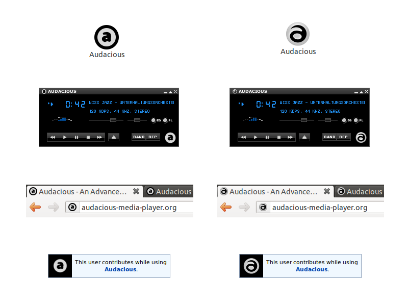
I spent some time on a graphic redesign/update of the current Audacious icon. Here it is, GPL licensed.
History
#1
 Updated by Michał Lipski over 14 years ago
 Updated by
 I like it, looks fresh and clean. Great work!
#2
 Updated by John Lindgren over 14 years ago
 Updated by
 Personally I like the old one better.
#3
 Updated by Jacopo Lorenzetti over 14 years ago
 Updated by
 - File 6-applications.png 6-applications.png added
Michał Lipski wrote:
I like it, looks fresh and clean. Great work!
Thank you!
I addressed some of the old logo's weaknesses, i.e.:
1. the way colors are used doesn't work equally well on dark and light backgrounds
2. the use of different logo designs (e.g. with and without the thick black circle outline or the dark outer glow) makes the logo less recognizable at first sight
3. the negative spaces in the type are too thin to work consistently at small sizes
#4
 Updated by Michael Schwendt over 14 years ago
 Updated by
 The proposed icon does not resemble an 'a' as the old one did. What does it try to illustrate? It looks like something else, not much like a letter at all (only a bit like Latin small Eth though) and with much reduced recognition value.
#5
Updated by Jacopo Lorenzetti over 14 years ago
In effect it does not resemble an 'a' as closely as the old one did, and this is precisely one of its strenghts in terms of distinctivity and 'recognition value'. Of course it's a symbol, not an illustration. The Nike 'Swoosh' doesn't try to illustrate or closely resemble anything and this doesn't negatively affects its value :)
#6
Updated by Michael Schwendt over 14 years ago
Don't say "the Nike Swoosh doesn't try to illustrate [...] anything". Graphics like that are a common way to illustrate motion/movement and speed, and this particular registered trademark has been really successful even. Btw, Wikipedia adds the following: "While most people would regard the symbol as a check mark, the Nike swoosh was inspired by the Greek goddess Nike, the winged goddess of victory. The swoosh evokes her flight."
When you want to create/establish a new icon, one of the questions that is raised is whether you want to express anything? It cannot be only technical reasons, such as colours and thickness of lines, when it has become a hardly readable 'a' that users likely won't even recognize as such.
#7
Updated by Jacopo Lorenzetti over 14 years ago
You criticized about what it 'resembles' and what it 'looks like' and I replied to that. Obviously, resembling something and evoking something are two completely different matters, as I already tried to make clear.
I can understand your confusion about that and I don't want to be rude, but I really don't have time to turn this feature request ticket in a first-year communication design school lesson for a single student (nor, worse, to start a flame with you). So I will not reply further and you are free to have the last word.
In addition, if you think that the current symbol better represents the core values of the Audacious project and works fine on a technical level, I suggest to just change the status of this request to Rejected. I think it would be a missed opportunity for Audacious but I am perfectly fine with that. I'll keep on using the Audacious player with a not-so-audacious icon :)
#8
Updated by John Lindgren over 14 years ago
- Status changed from New to Rejected
Closing this. Whatever the technical merits of the proposed icon, I don't think a complete redesign of the logo is a good idea. Some consistency in branding is a good thing. Feel free to discuss this in more depth on the forums.
